Web Redesign · Supporting Project · 2025
RIT University News Redesign.
Web redesign improving readability and information hierarchy for a university news platform.
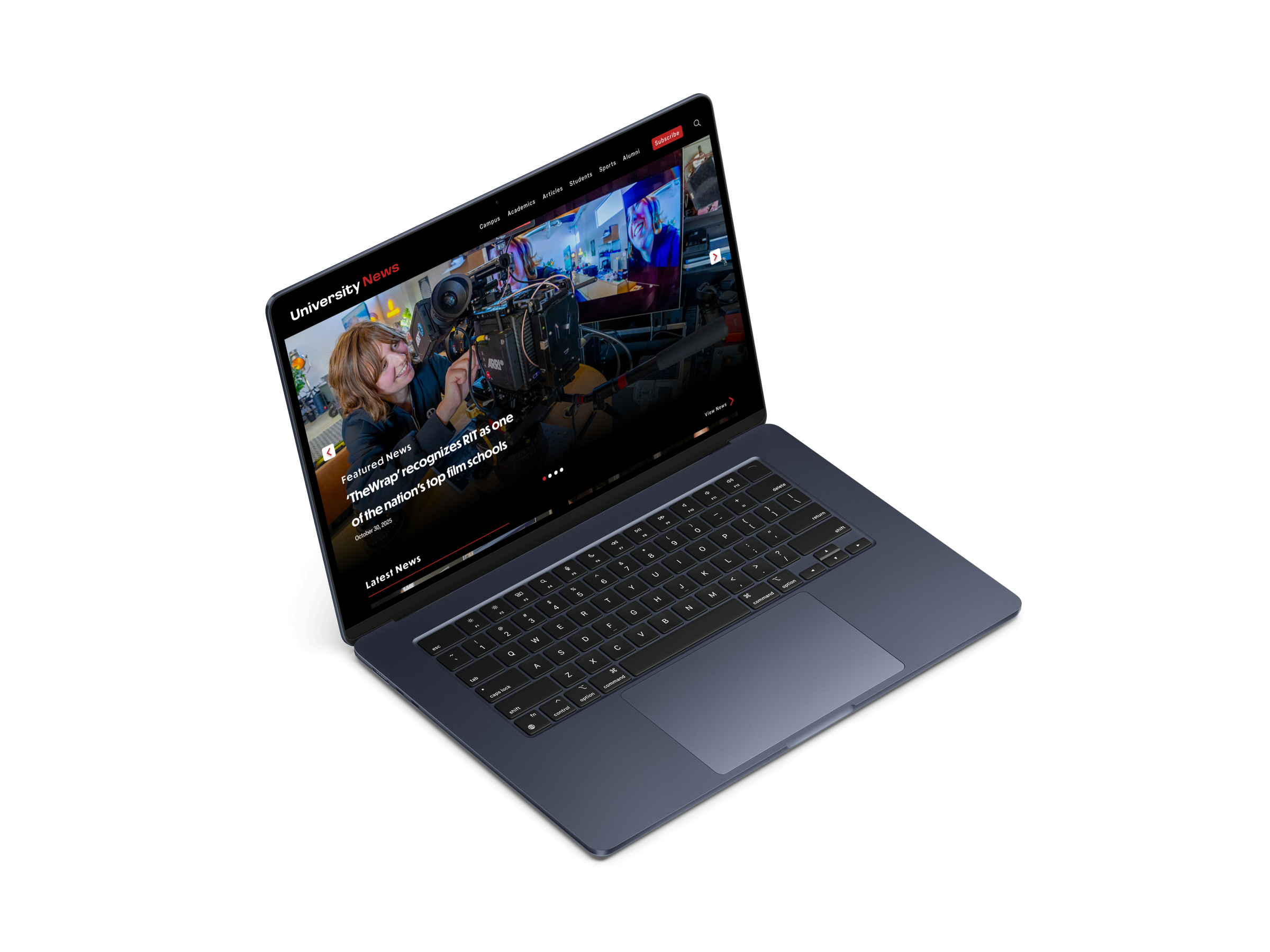
Overview
The original RIT News homepage tried to serve everyone at once without a clear hierarchy. Everything competed for attention equally, which made it harder to scan, navigate, or know where to start. This project focused on restructuring the layout so every section has a clear job, without touching the content itself.
Problem
The original RIT News layout made it hard to quickly scan articles or understand what content lived where. The full RIT site header dominated the top of the page, pulling attention away from the news itself. Headlines competed for attention, spacing was inconsistent, and moving between sections felt unclear. Users had to work harder than they should to find relevant news.

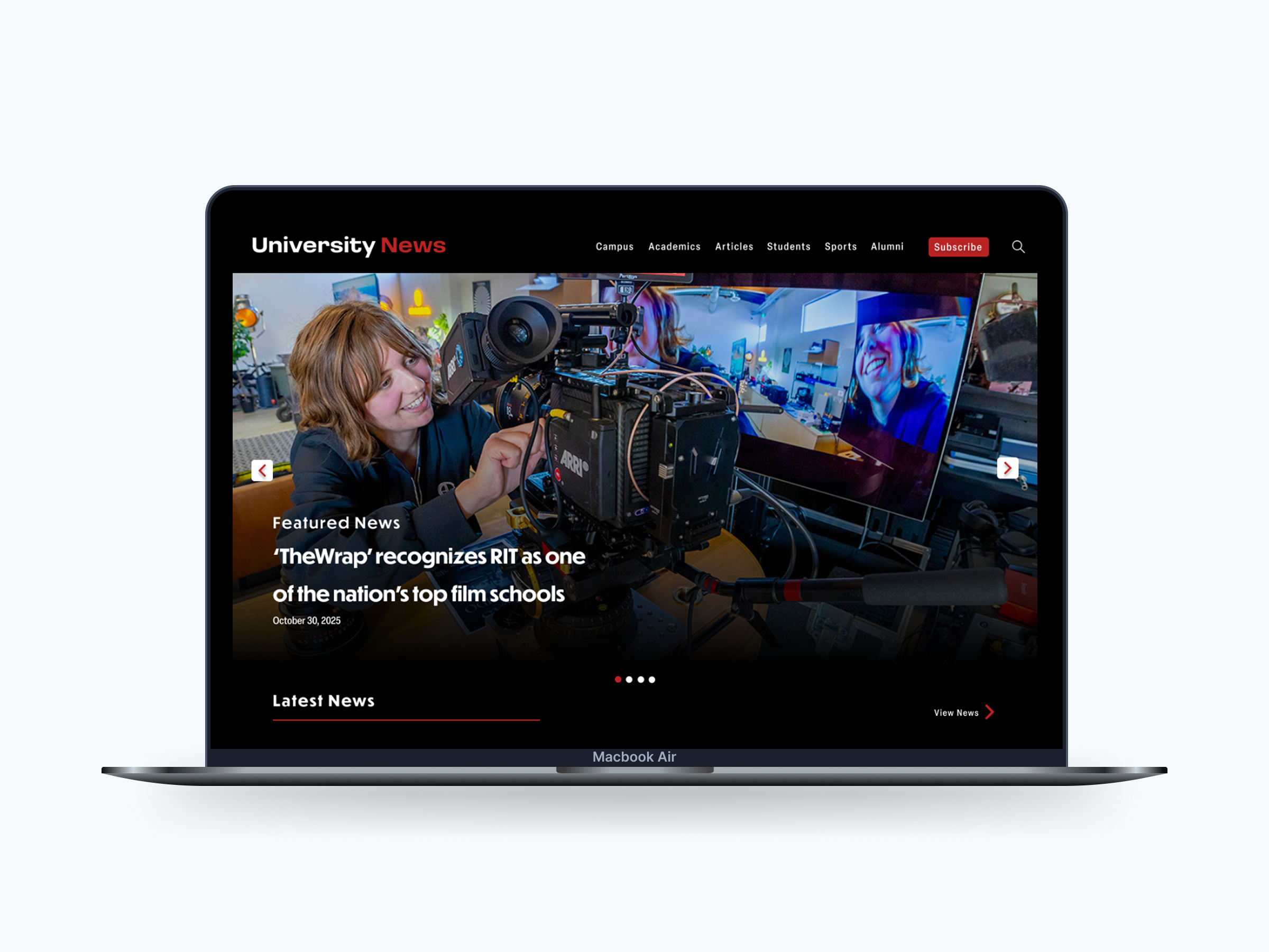
The original nav carries the full RIT site header, which competes with the news content. I simplified it to a focused news-specific navigation.
Goals
- Improve article readability
- Strengthen visual hierarchy so featured content stands out
- Simplify how users navigate between categories
- Create a more structured, responsive layout
Design Improvements
Improved Information Hierarchy
I restructured the featured news section to use a full-bleed hero image with a clear label, headline, and date layered on top. In the original, a static two-photo layout with a sidebar list made it hard to tell what the primary story was.

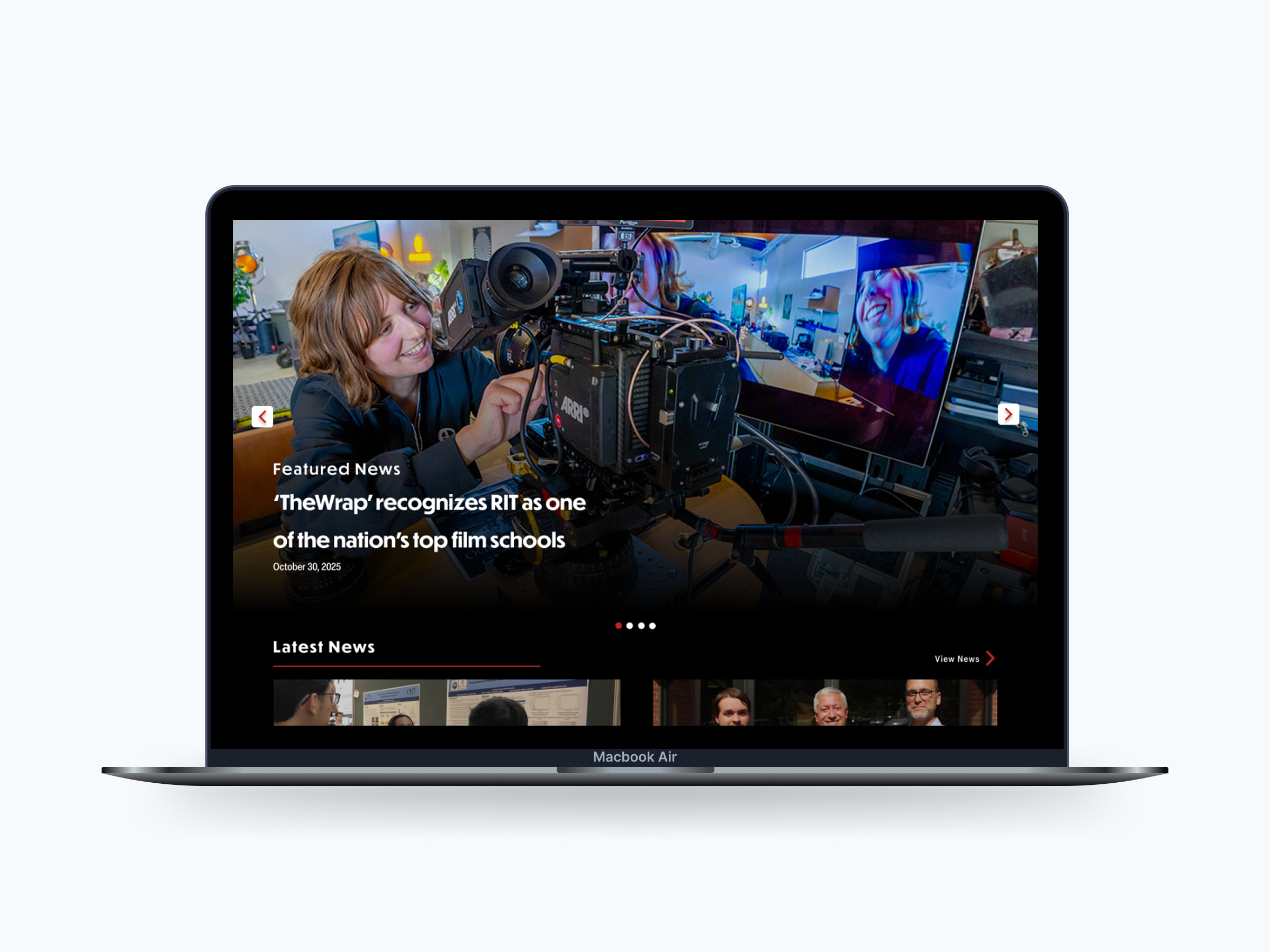
The original featured section buries the lead. The redesign puts one strong story front and center with clear visual weight.
Category Labels for Faster Scanning
The original Latest News grid had no category labels, so users had to read each headline to figure out if it was relevant to them. I added prominent category tags directly on the images so users can scan by topic at a glance.
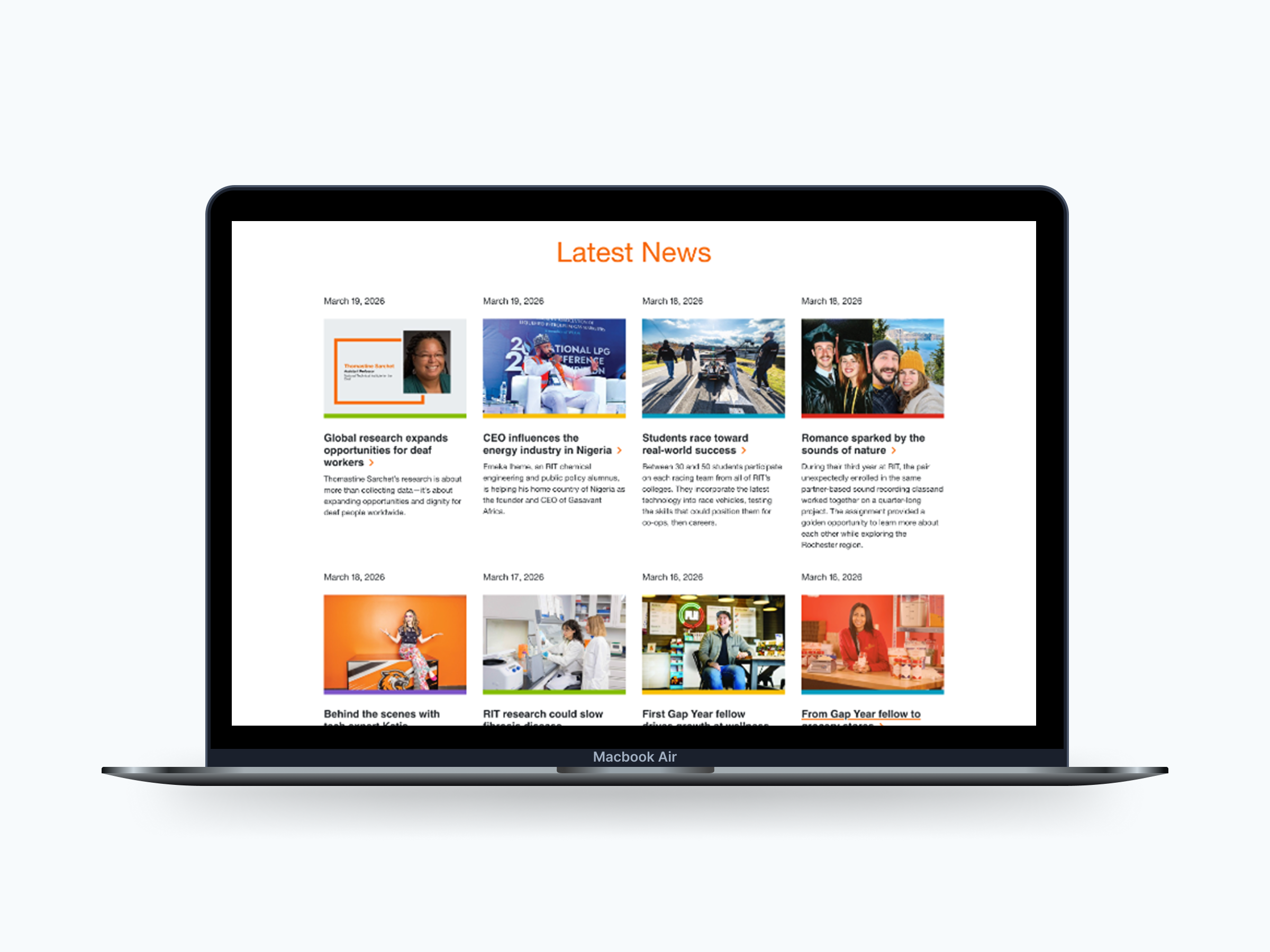
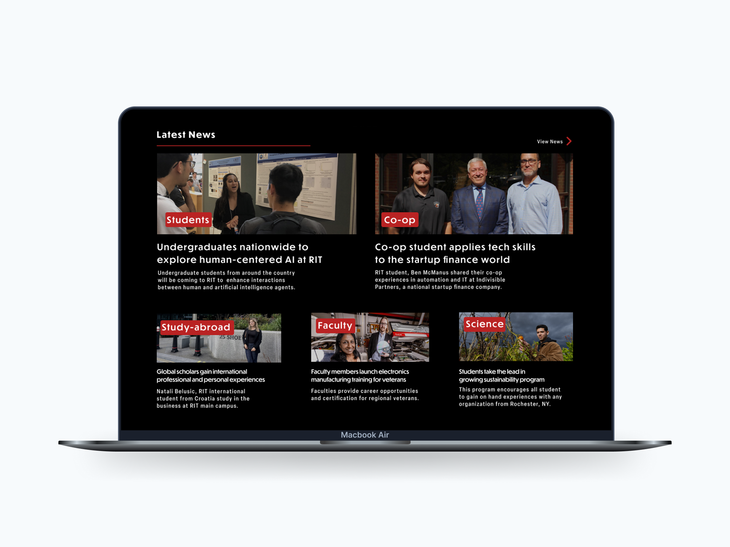
Category tags on the redesign let users filter visually without reading every headline.
Cleaner Section Organization
The original events and publications area used large orange blocks with competing calls to action. I reorganized these into a dark-themed section with clear groupings for Upcoming Events and Alumni Spotlight, making each content type easier to find and understand at a glance.
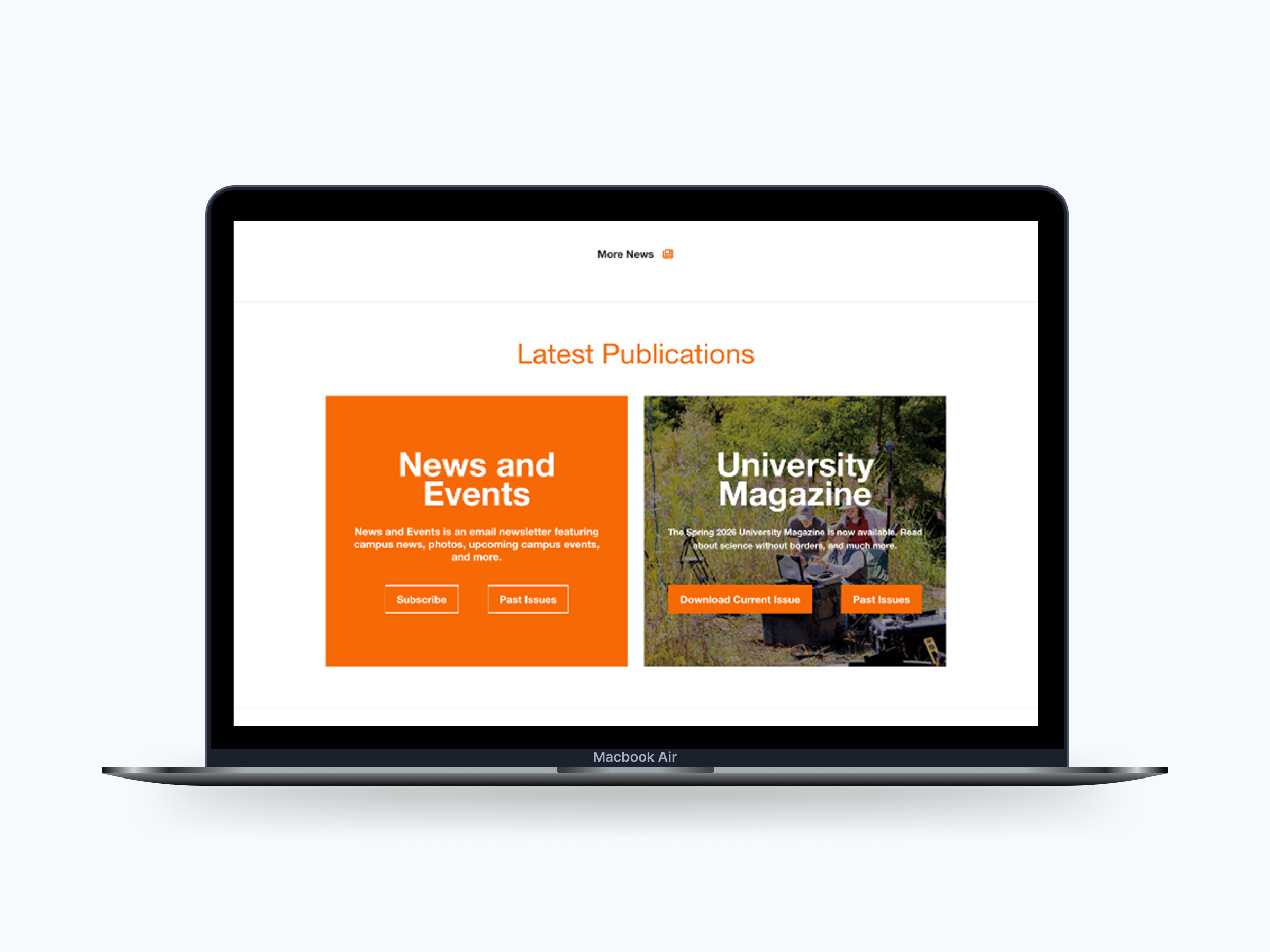
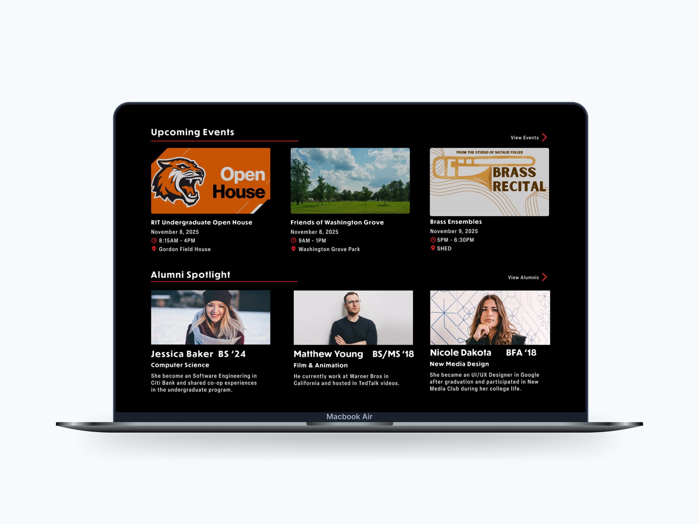
The redesign separates content types into clearly labeled groups instead of stacking competing blocks.
Sports Gets Its Own Identity
The original athletics section used the same generic grid as everything else on the page. I gave sports its own dark-themed section with live game cards and featured matchups, making it immediately recognizable as a distinct content area.
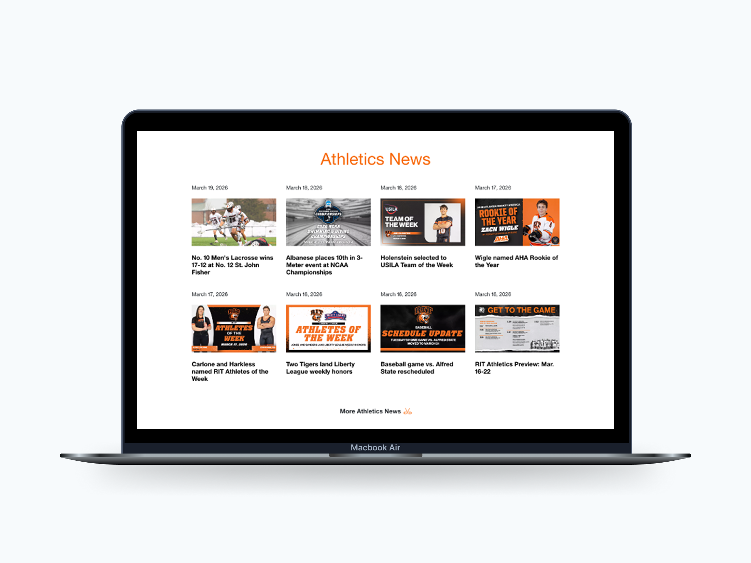
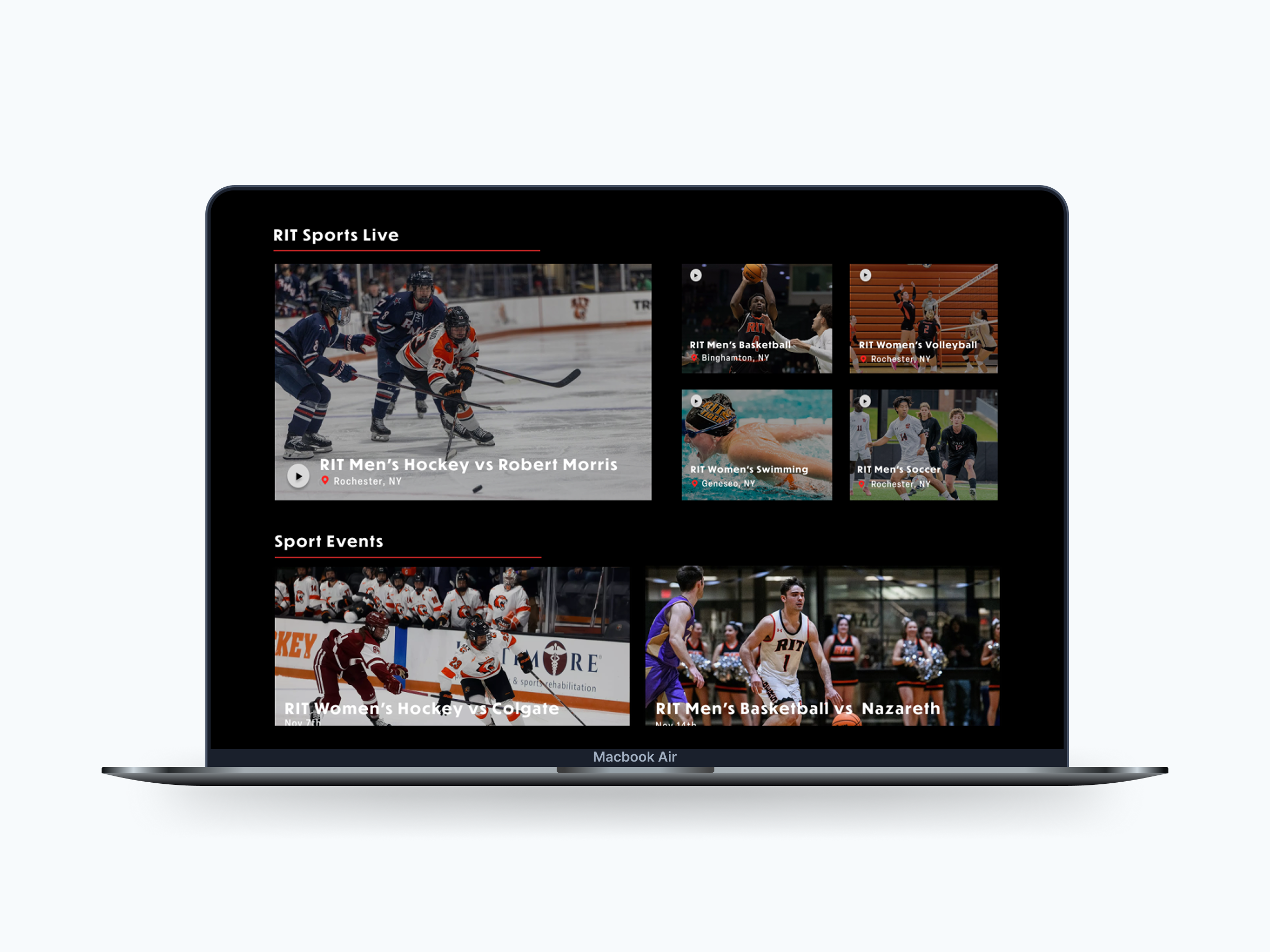
Sports content now has a dedicated visual identity instead of blending into the rest of the page.
Outcome
The redesigned RIT News page gives every section a clear job, so readers spend less time figuring out where to look and more time actually reading.
Reflection
This project taught me that hierarchy does most of the work before a user reads anything. It shapes attention before content gets a chance to. Next I'd push the typography further and test whether the type scale changes actually affect how users scan the page.