UX Design · Information Architecture
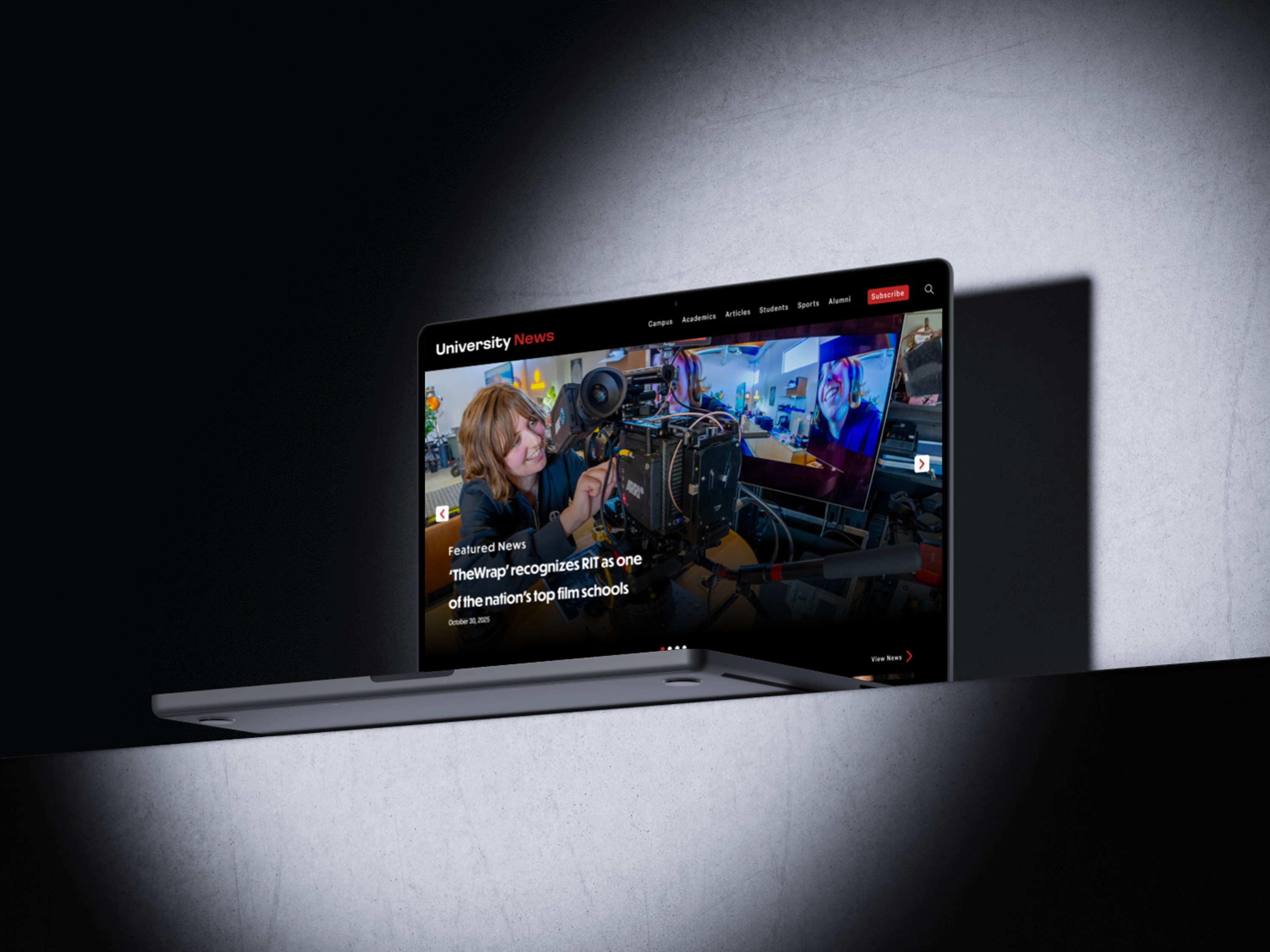
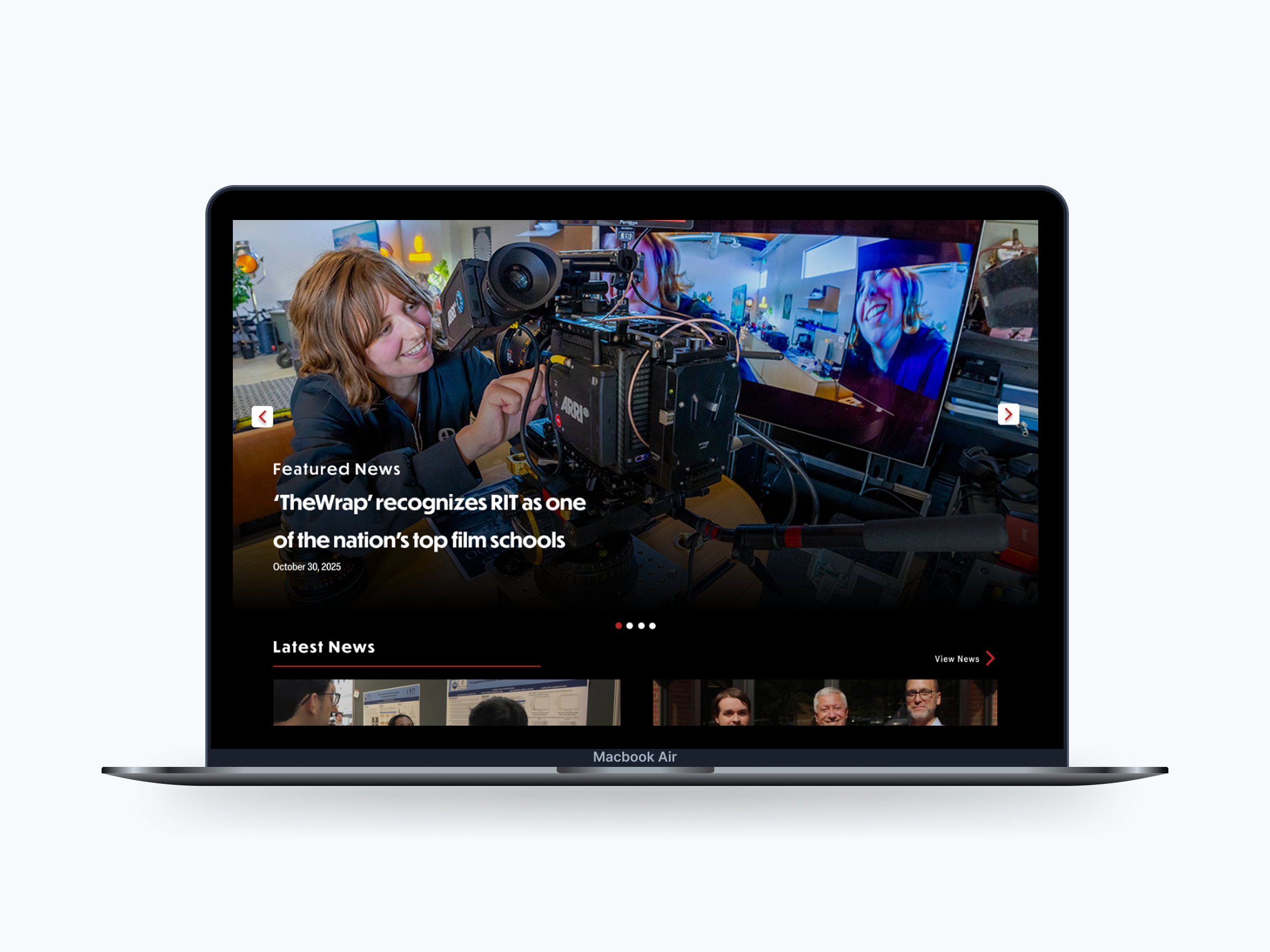
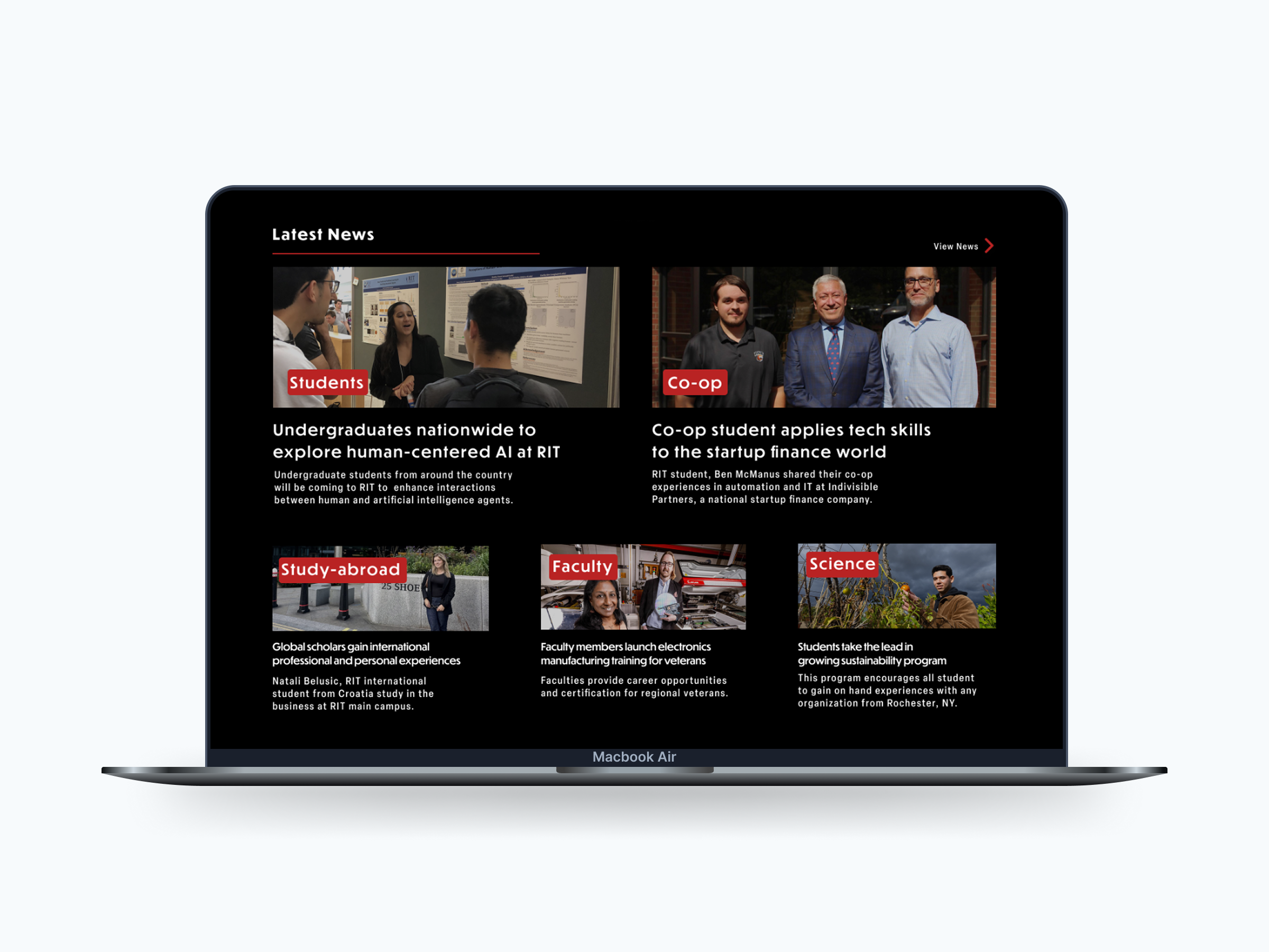
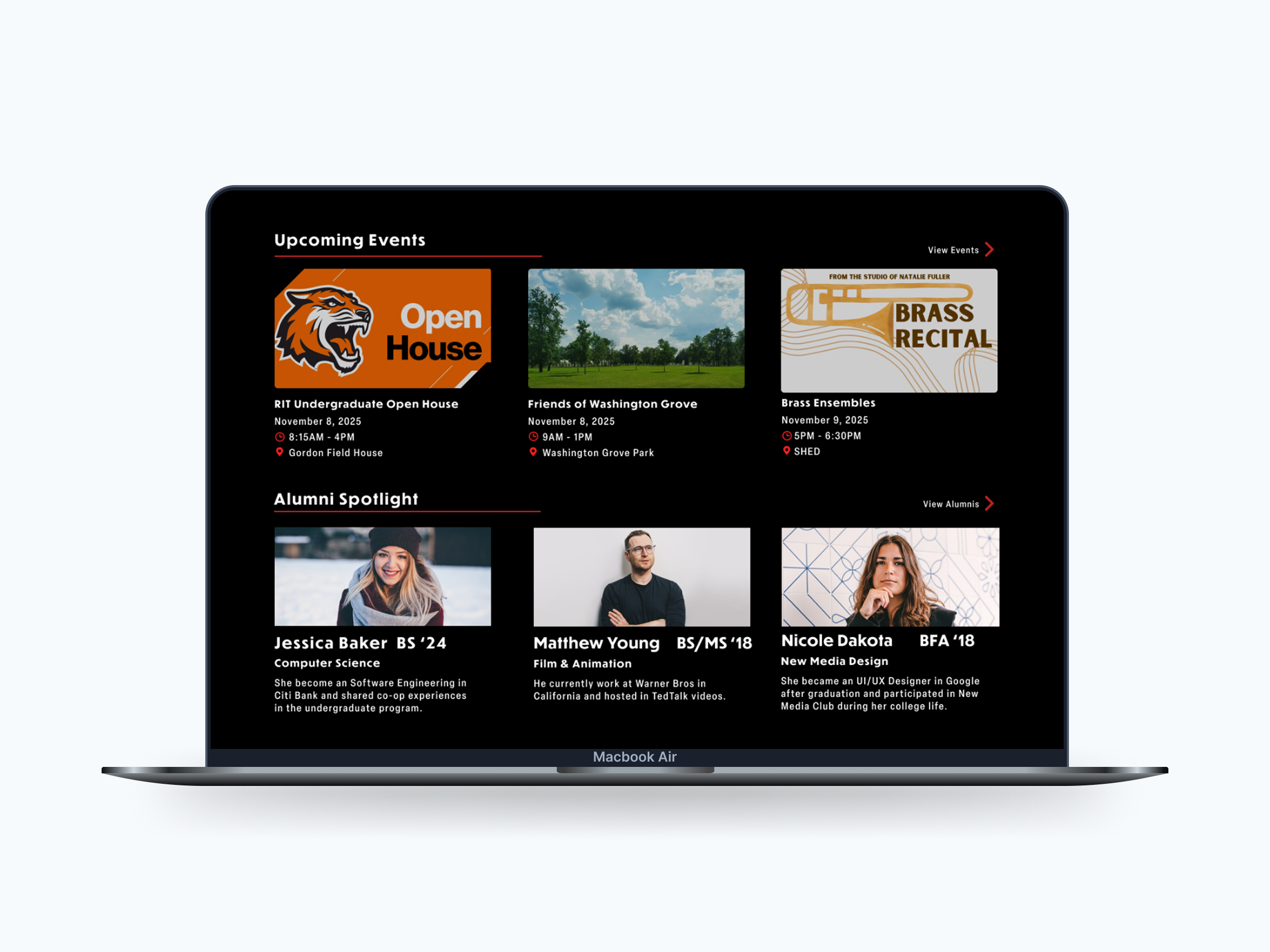
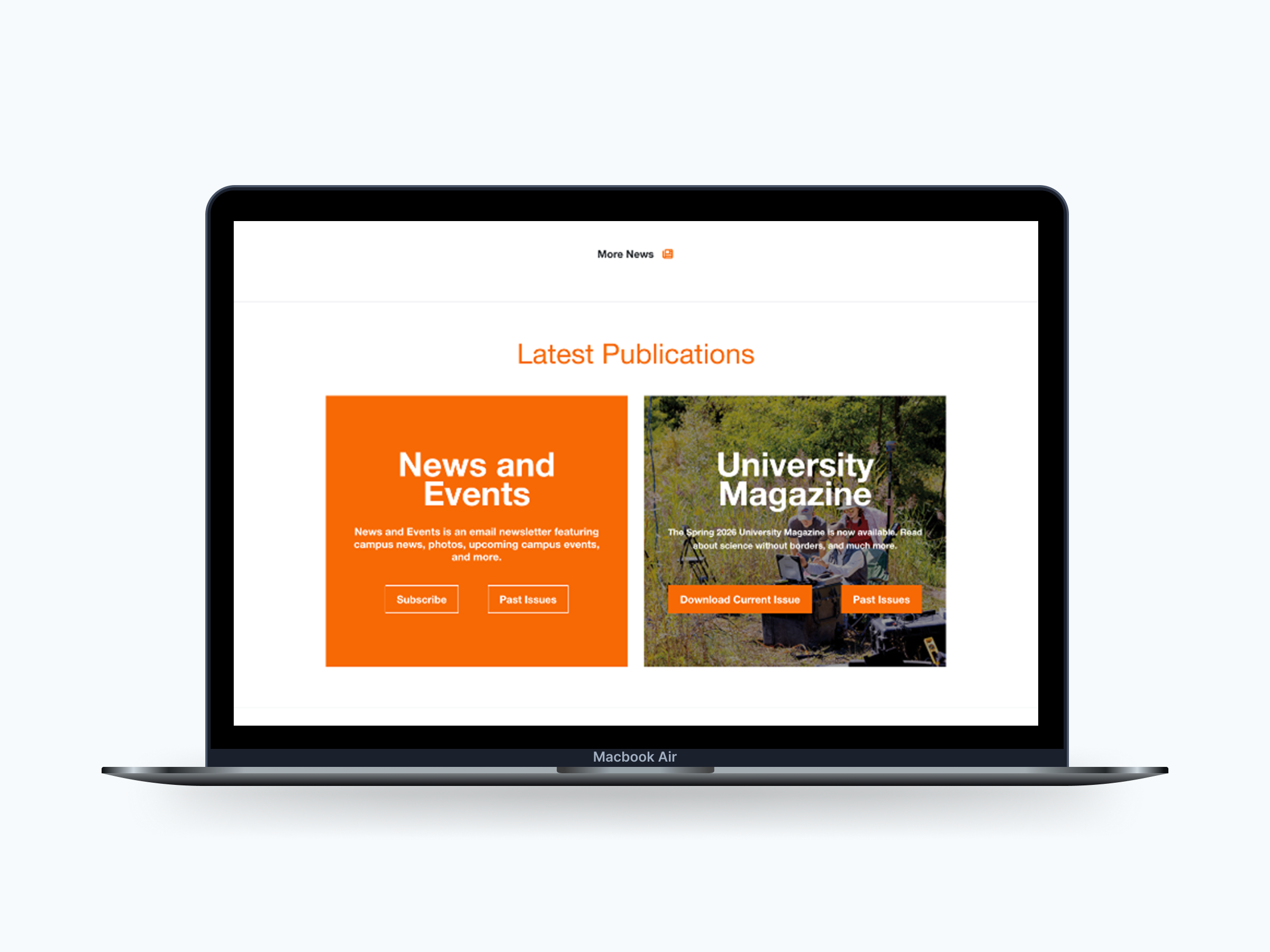
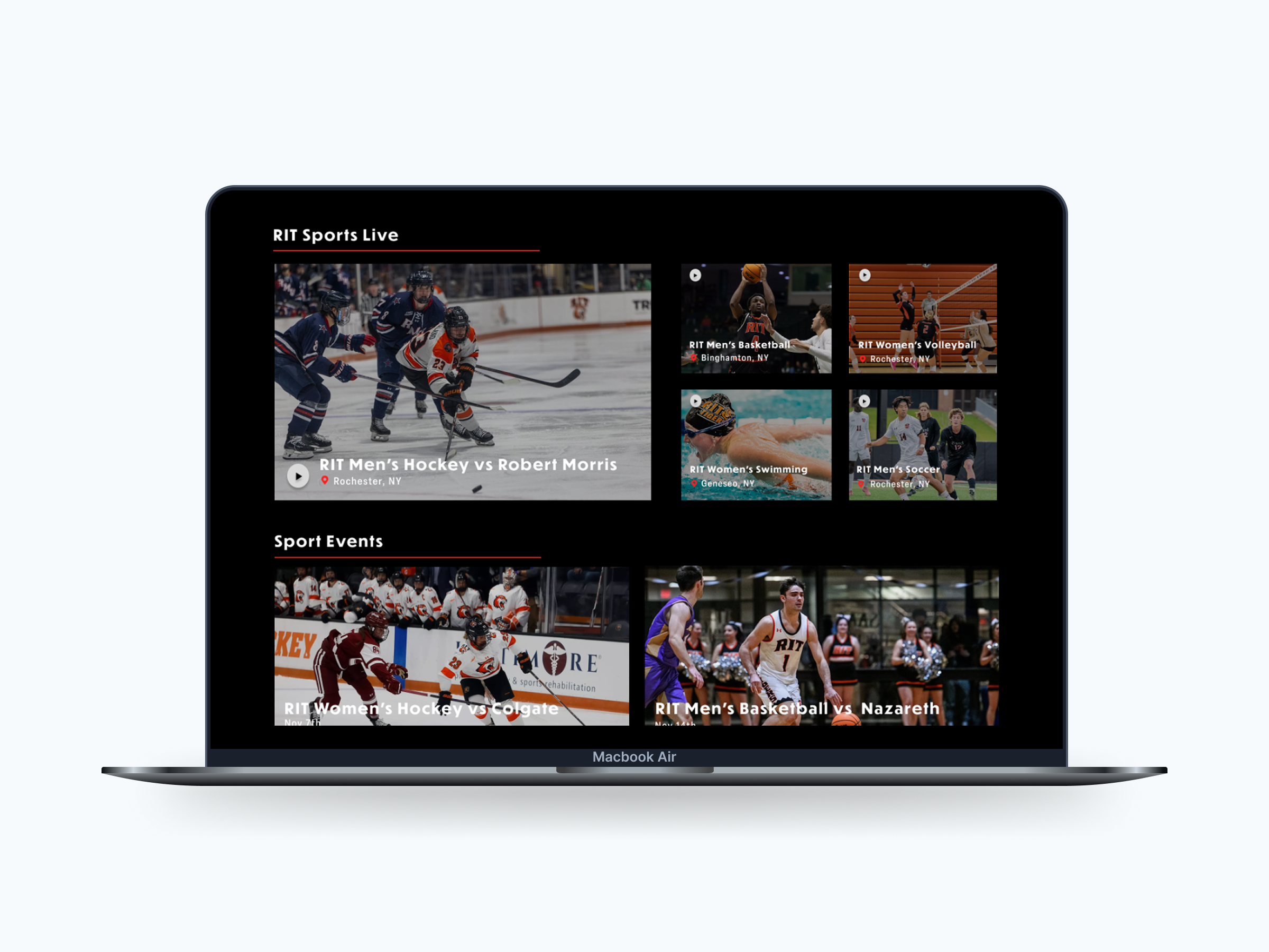
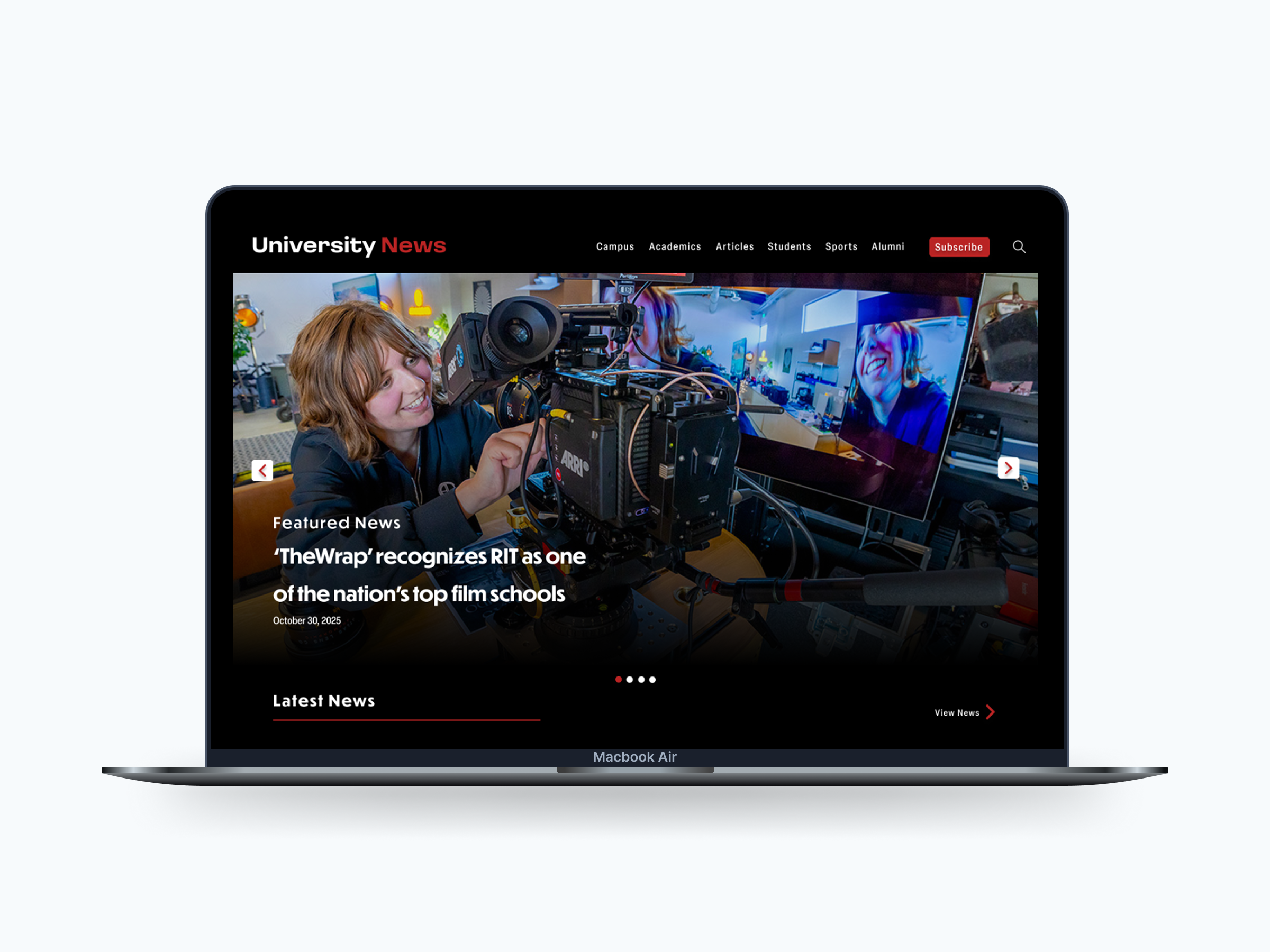
This project rethinks the RIT University News homepage as a more structured, reader-first experience.
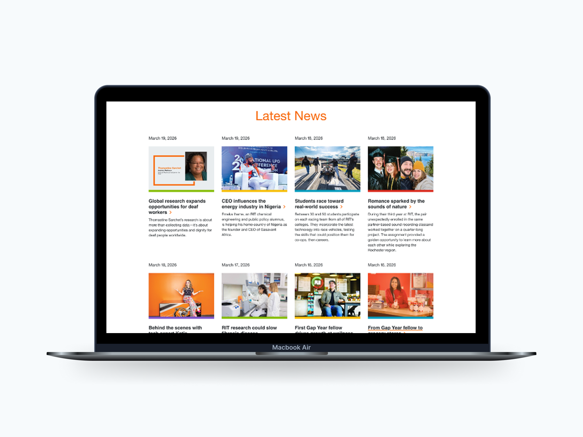
The original page tried to serve multiple audiences at once, but without a clear hierarchy. Everything competed for attention, which made it harder to scan, navigate, or know where to focus. The redesign introduces clearer structure, defined content zones, and a layout that better matches how people actually read online.
1 — Problem + Role
The homepage lacked a clear visual hierarchy, most content was treated equally, even when it shouldn't be.
Because of that, users had trouble:
The experience felt fragmented, with a higher cognitive load than necessary.
2 — Research Insights
Survey data from 858 respondents highlighted a gap between what users wanted and what the homepage emphasized:
These insights directly influenced how content was prioritized and placed in the layout.
3 — Design Principles
4 — Key Design Decisions
A prominent hero section establishes a clear starting point and sets editorial priority.
Drag to compare, original vs redesigned featured story.
Content is organized into three main areas:
Drag to compare, original vs redesigned latest news stream.
Drag to compare, original vs redesigned events and discovery zone.
Moving away from repeated card patterns improves recognition and makes sections easier to scan.
Drag to compare, repeated cards vs a content-specific sports layout.
Allows users to access key areas directly instead of relying on browsing.
Drag to compare, original vs redesigned top navigation.
5 — Outcome & Impact
Design System
Color Palette
#000000
Background
I used black to keep the layout clean and focused. It helps reduce visual clutter and makes headlines and images stand out more.
#FCFCFC
Primary
I chose an off-white instead of pure white because it's easier on the eyes, especially for longer reading. It still has a strong contrast on the dark background without feeling too harsh.
#B92323
Accent
I used red in small moments like icons and the "News" label to draw attention where it matters. It helps users quickly spot important elements and scan the page more easily.
Typography
Display / Headings
Loos Wide
Bold
Used for headlines to create a strong, modern editorial feel. The wide proportions and bold weight help titles stand out clearly and establish a clear visual hierarchy.
Body / UI Text
Elza
Medium
Chosen for its clean, narrow structure, which improves readability and allows more content to fit comfortably on the page. It keeps longer articles easy to scan without feeling cramped.
6 — Reflection
This project taught me that hierarchy isn't decoration, it's how people actually navigate a page. Once I designed around how readers really scan and choose, every layout decision had a clear reason behind it.