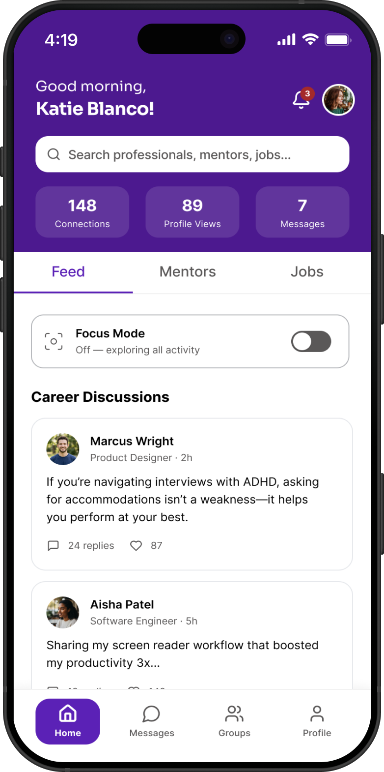
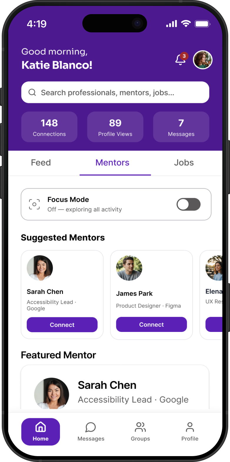
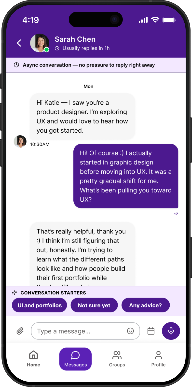
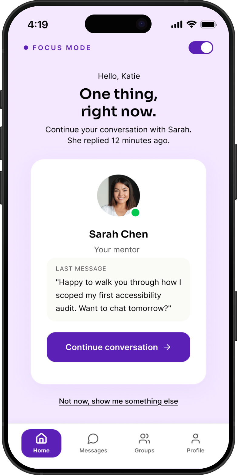
UX/UI · Accessibility · Mobile
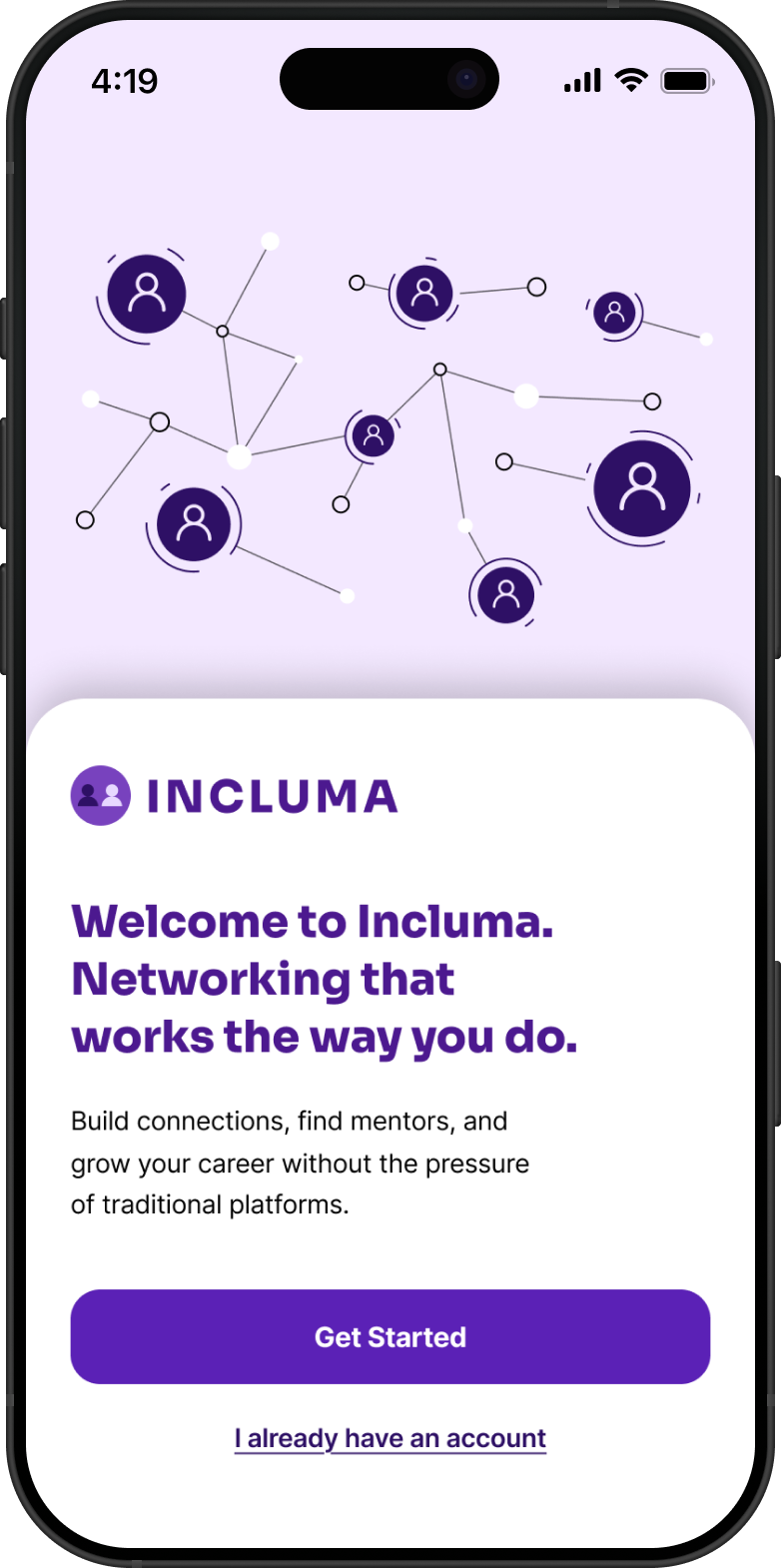
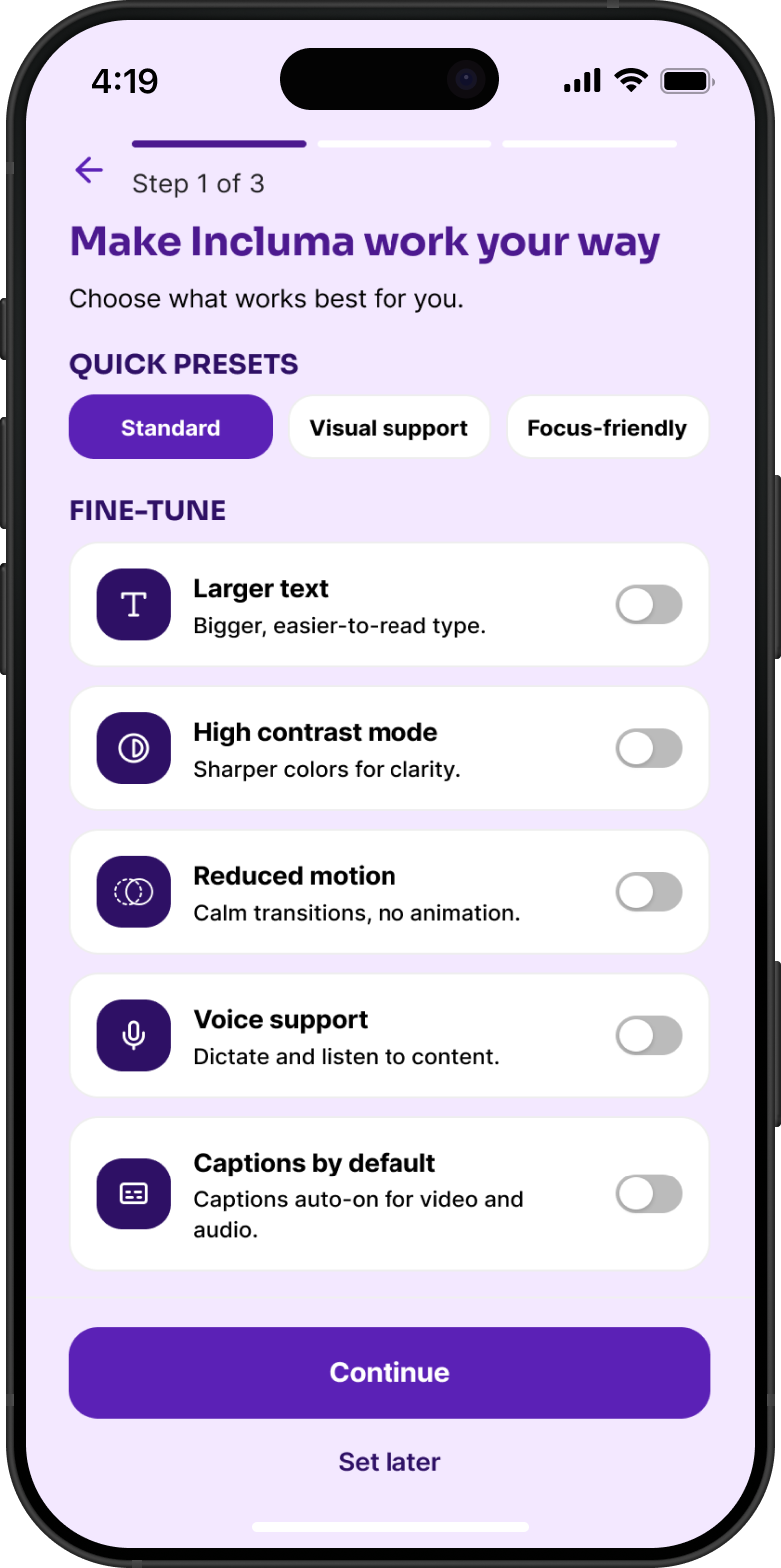
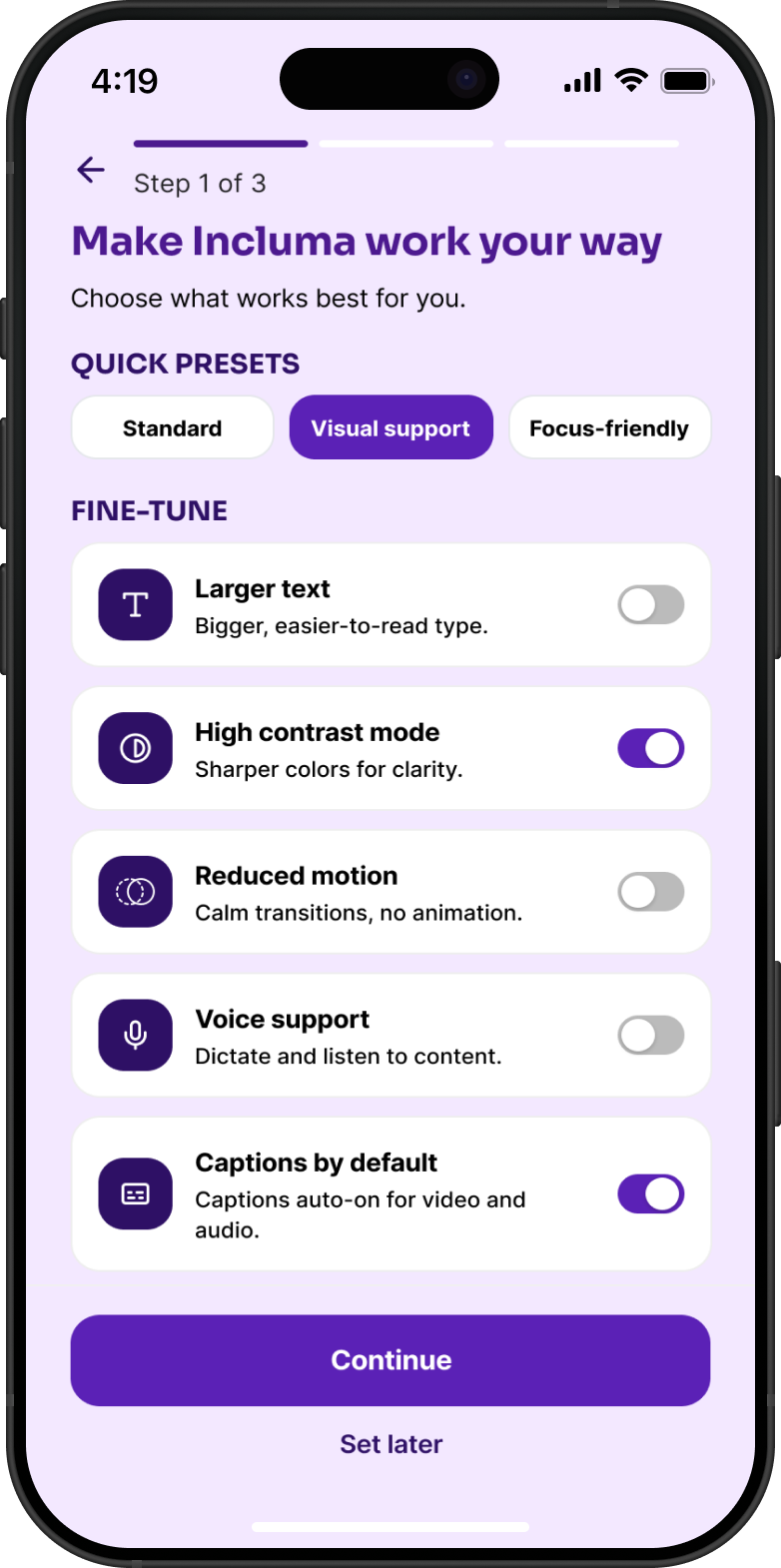
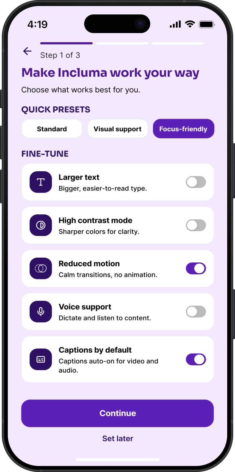
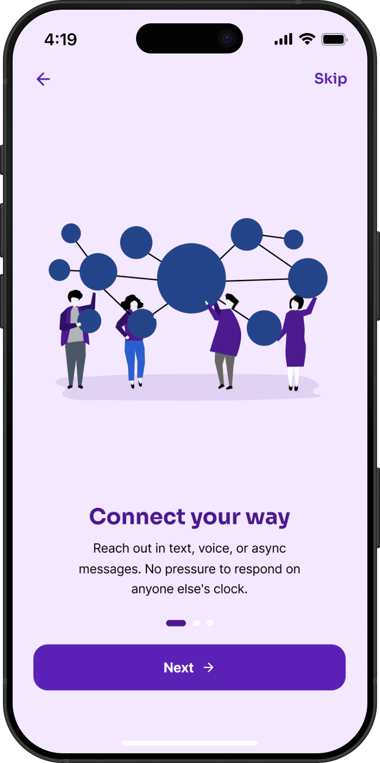
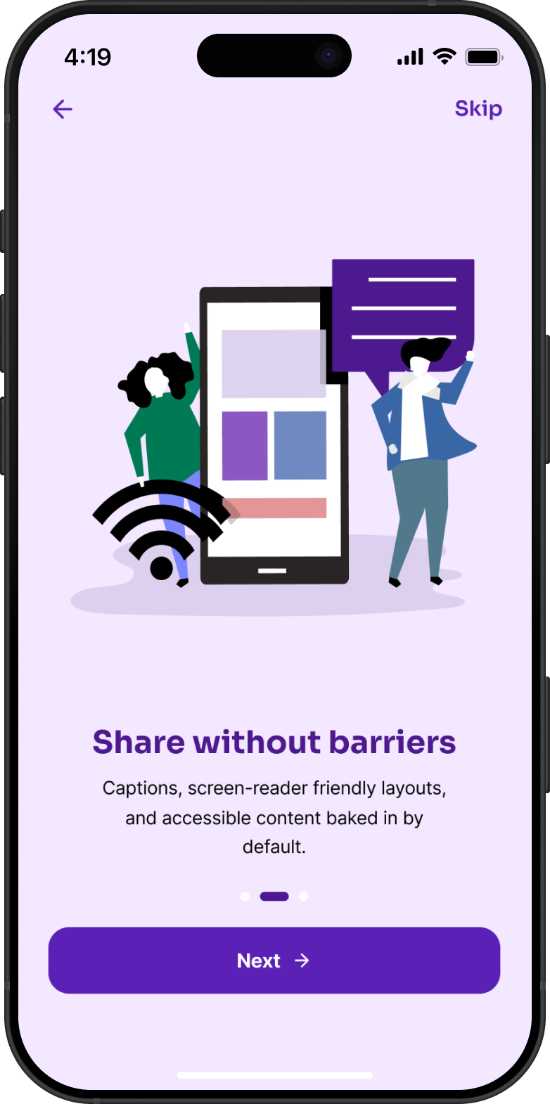
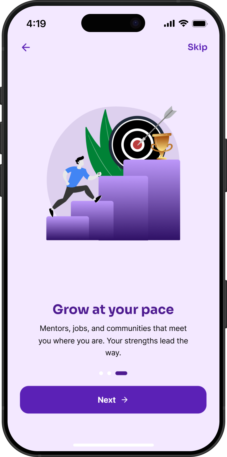
Most networking platforms create barriers for disabled professionals before they even get started. Incluma rethinks that experience by putting accessibility first, building mentorship into the product, and removing the pressure that usually comes with networking.
1 — Problem
Networking platforms are typically designed with a "default" user in mind. Because of that, disabled professionals often run into friction early, whether that's inaccessible interfaces, pressure to reach out to strangers, or difficulty finding mentors who actually understand their experiences.
2 — Research
I looked at LinkedIn and Glassdoor for insights into onboarding, accessibility, communication patterns, and mentorship. While both platforms offer some accessibility features, they're not part of the core experience.
A few patterns stood out:
Design Opportunity
There's an opportunity to design a networking experience where accessibility, mentorship, and lower-pressure interaction aren't add-ons, they're the foundation.
3 — Design Principles
4 — Key Design Decision
Most platforms hide accessibility settings deep in menus. Incluma brings that step forward.
Users can choose a quick preset or adjust specific preferences before they ever reach the main experience. That way, the product adapts to them, not the other way around.
Standard preset
Visual support, high contrast + captions
Focus-friendly, reduced motion + minimal UI
5 — Onboarding
The onboarding flow focuses on explaining value before asking for input. Each step is skippable, so users can move at their own pace.
Welcome, "Networking that works the way you do"
Connect your way, text, voice, or async
Share without barriers, captions baked in
Grow at your pace, mentors & jobs that fit you
6 — Core Experience
The product is centered around three main areas:
Feed, focused mode toggle, curated content
Mentors, browse featured mentors and connect
Messages, async first, no pressure to reply
7 — Focus Mode
A full feed can be a lot. The Focus Mode toggle, visible on the home screen, strips everything back to a single, clear next action: pick up where the last conversation left off. No infinite scroll, no competing notifications, no decision fatigue.
It's the clearest expression of the first design principle, reduce cognitive load, turned into a feature the user controls.
Focus Mode on, one surfaced action at a time
8 — Outcome & Impact
Design System
Color & contrast. All color combinations are designed to meet WCAG AA standards, including high-contrast options.
Typography. Type choices prioritize readability across different screen sizes and accessibility needs.
Color Palette
#F3E8FF
Background
Soft lavender that keeps screens calm. Chosen specifically to avoid the harsh white that can feel overstimulating.
#5B21B6
Primary
Used for buttons, active states, and anything the user needs to act on.
#2E1065
Secondary
Deep and grounding. Used for headers, message bubbles, and text that carries the most weight.
#4C198F
Accent
A deeper supporting purple for icons, nav, and secondary surfaces, present but not competing.
Accessibility Note
All color combinations pass WCAG AA contrast requirements, verified against both standard and high-contrast preset modes.
Typography
Display / Headings
Sora
Aa Bb Cc Dd Ee Ff Gg 0123
Rounded and modern without feeling corporate. Sora keeps headings friendly and easy to scan, important for users who may experience reading fatigue.
Body / UI Text
Inter
The quick brown fox jumps over the lazy dog
Built for screens. Inter stays crisp and readable at small sizes, which matters a lot in an app where accessibility is core, not an afterthought.
9 — Reflection
This project changed how I think about accessibility. Instead of treating it as a checklist at the end, it became a starting point for every decision.
Designing for accessibility didn't just support a specific group, it led to a simpler, more focused experience overall.